Brand Identity
Packaging Design
Brand Strategy
Visual System

Overview
Most protein brands still look like they were designed for bodybuilders in 2016.
Loud claims, sterile packaging, black tubs, aggressive typography.
Chase already had a solid product. What it lacked was a point of view.
As someone who genuinely consumed the product, the disconnect became obvious. The experience felt modern. The branding didn’t.
Strategic Shift
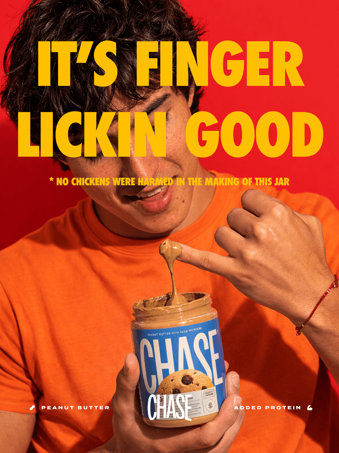
The goal wasn’t to make Chase look “premium”.
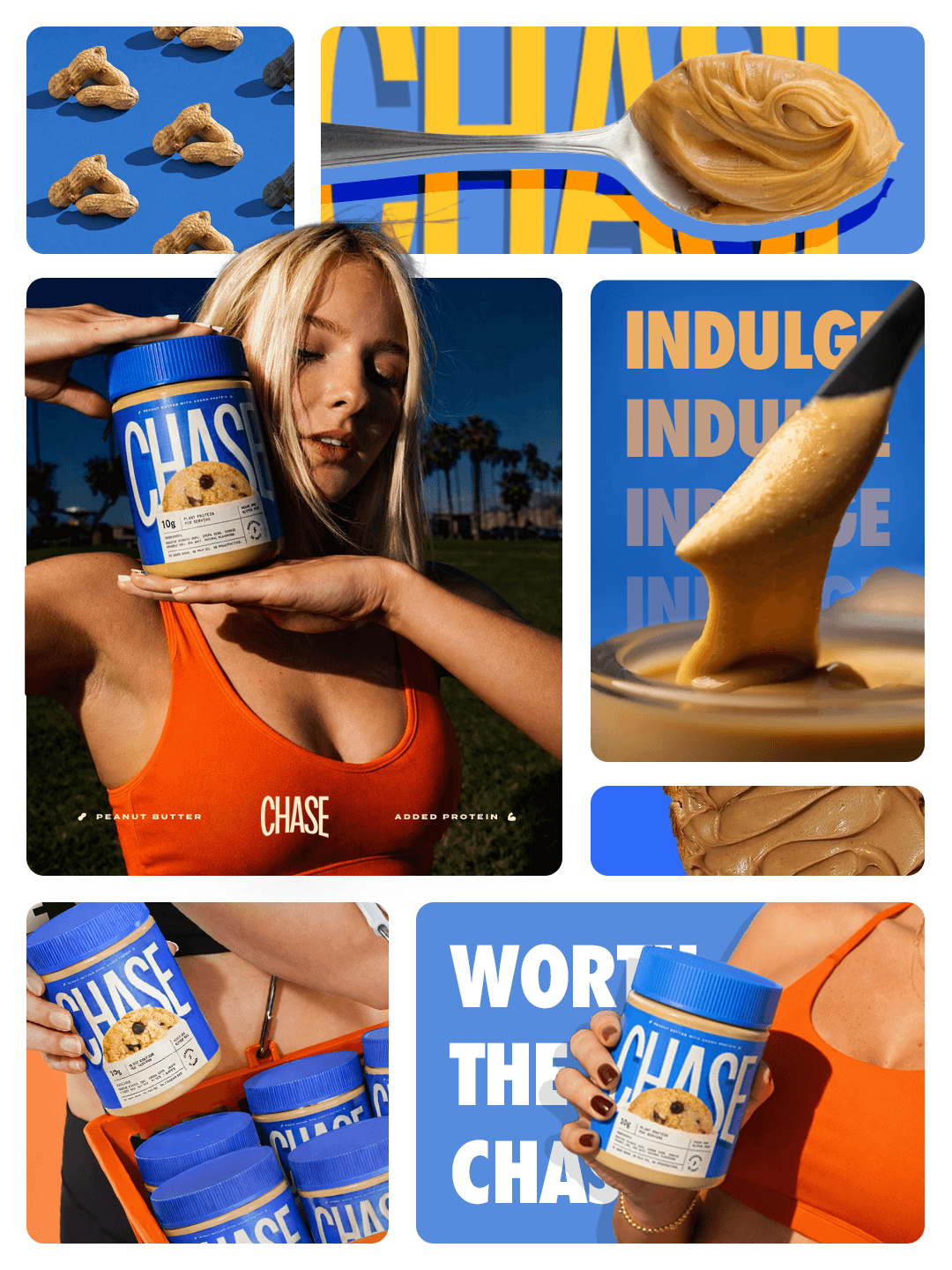
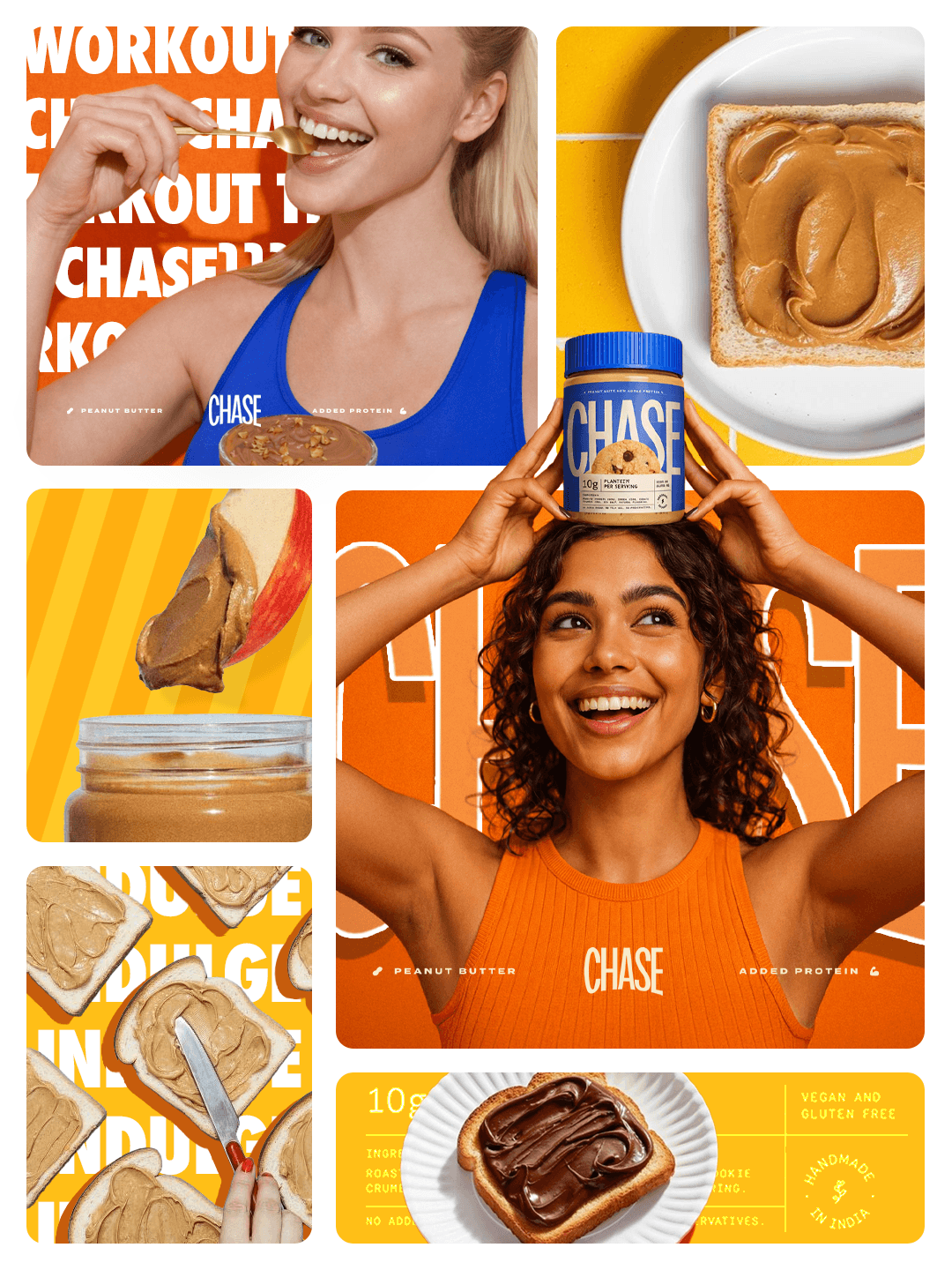
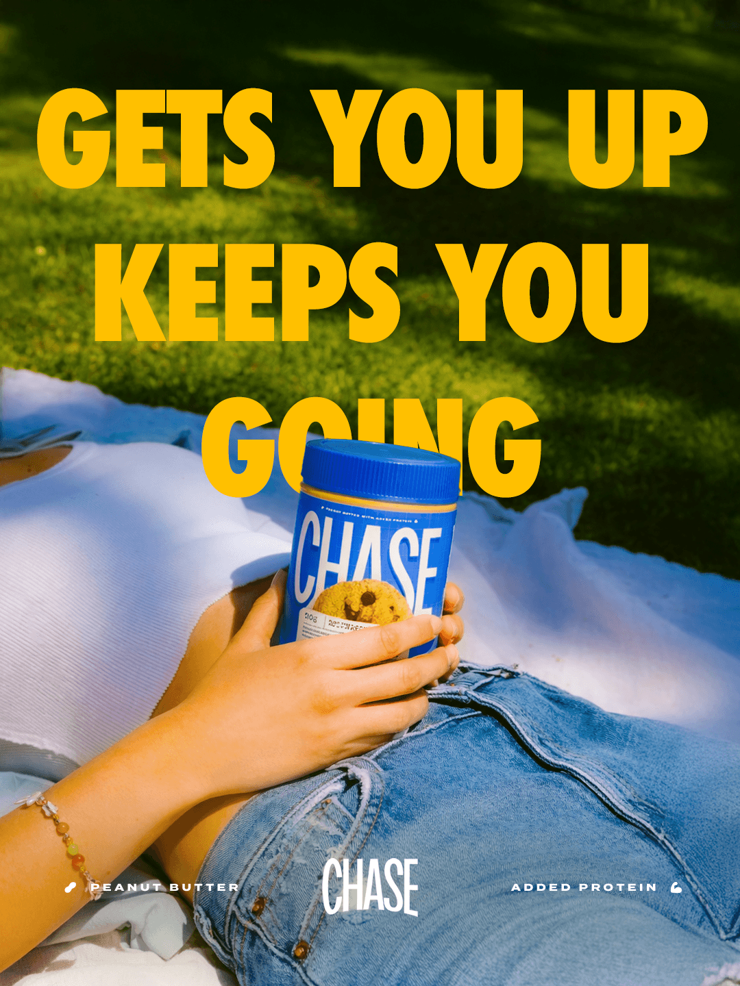
It was to make protein feel casual, snackable, and culturally relevant.
The redesign intentionally moves away from:
hardcore fitness aesthetics
supplement-store visual language
hyper-masculine branding cues
cluttered nutritional communication
…and toward something more everyday, expressive, and digitally native.
Design Language
The existing brand suffered from:
Weak shelf presence and poor recall
Generic supplement-style aesthetics
Lack of emotional or lifestyle positioning
Inconsistent visual language across products
No differentiation from competitors in the protein category
This created a disconnect between product experience and brand perception, limiting its growth potential in the D2C space.
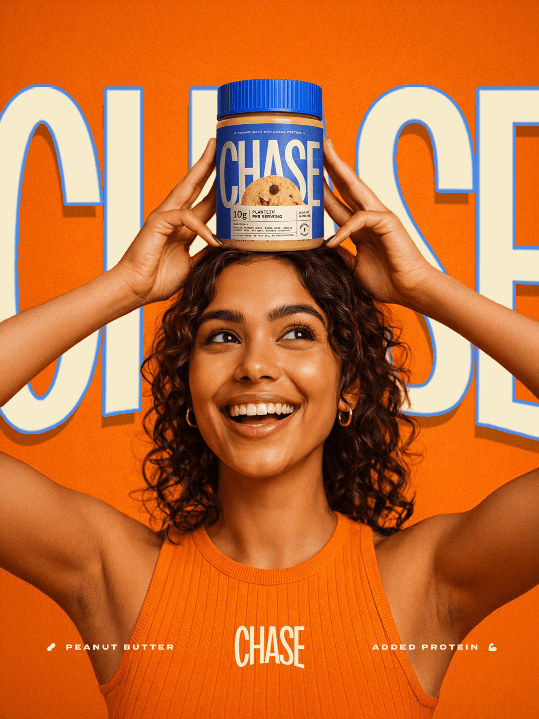
The Redesign
The redesign positions Chase closer to contemporary food and lifestyle brands than traditional supplement companies.
The intention was to create something that could naturally exist across quick commerce apps, creator collaborations, convenience stores, and culture-led digital campaigns.
Key strategic shifts:
Move from “gym supplement” → “everyday snack”
Build a bold, youth-driven visual language
Create a system that works across SKUs and future expansion
Introduce personality, energy, and memorability
Design for both digital-first D2C and physical shelf impact
Outcome
The final system feels energetic, scalable, and instantly recognisable.
More importantly, it gives Chase a clearer personality in a category where most brands still look interchangeable.
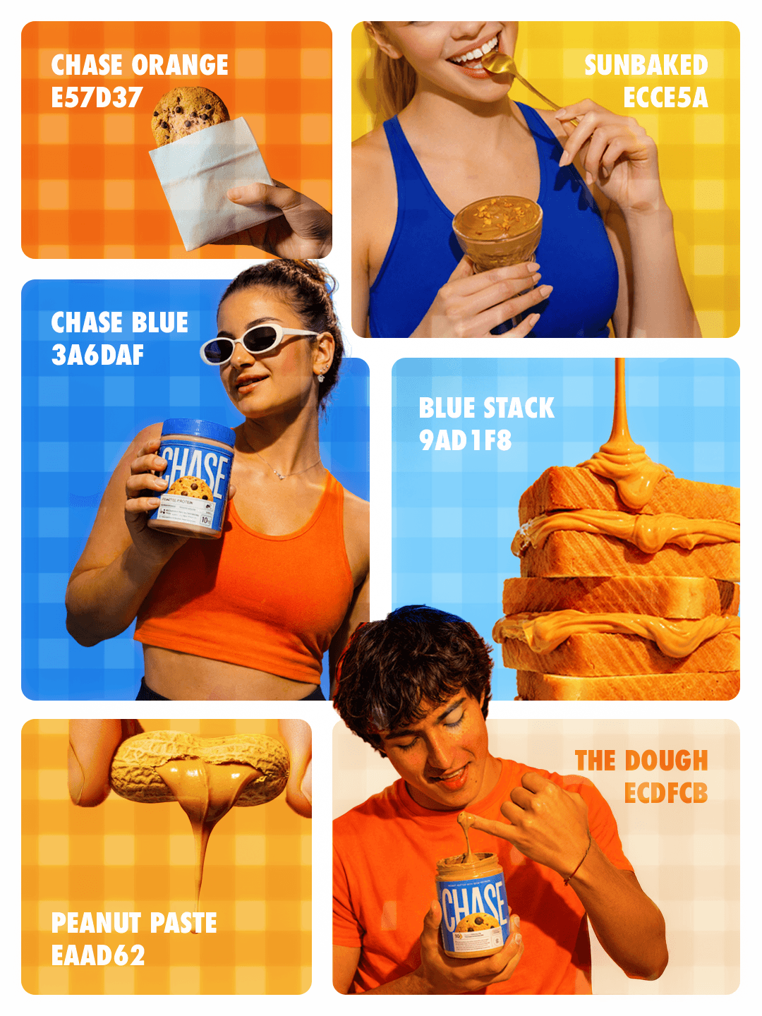
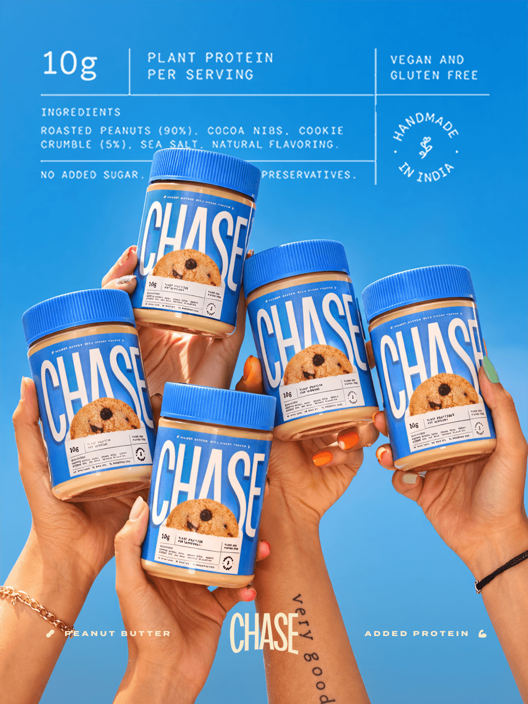
Key Elements
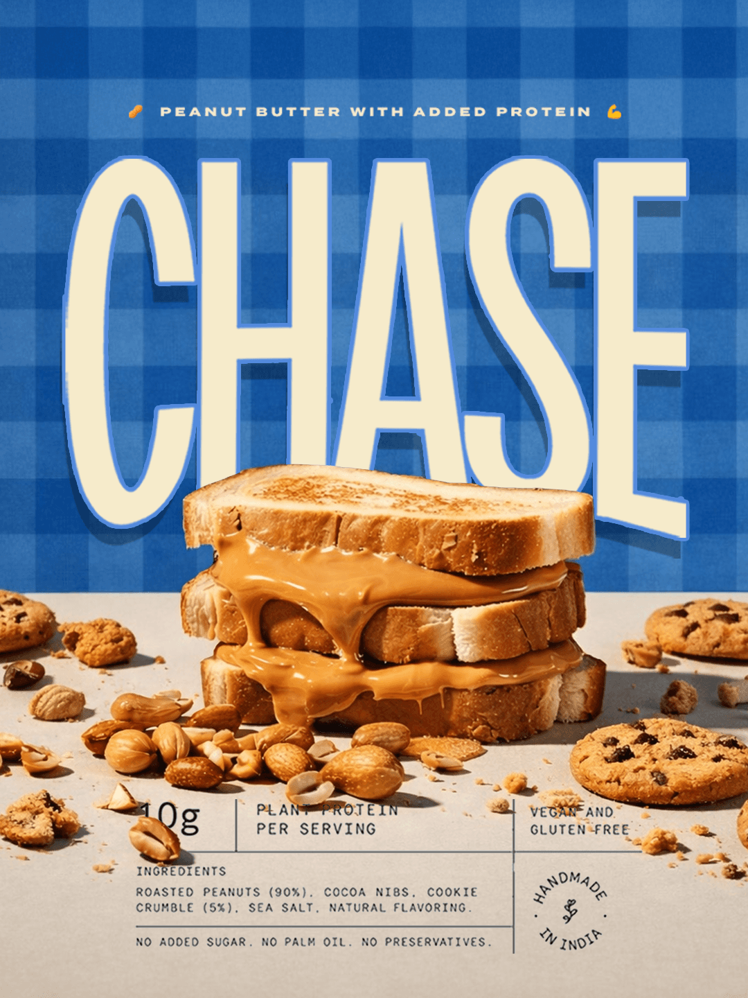
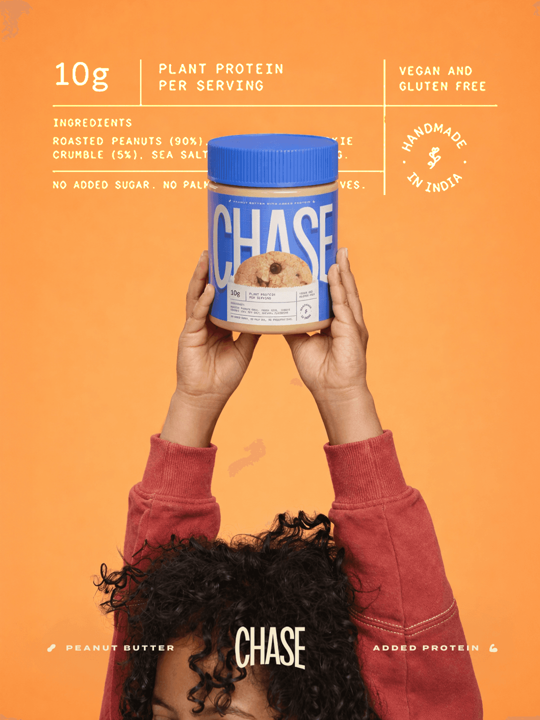
Punchy color palette for instant recognition
Bold typography for high recall and attitude
Clean information hierarchy to improve usability
Iconography + graphic devices to create a scalable system
Packaging that feels snackable, not clinical
The result is a brand that feels alive, contemporary, and built for scale.

