Brand Identity
Social Media Design
Design System
Logo Design
OCS, also known as One Click Stays, is a beach focused travel booking platform. I led the complete brand refresh, including logo design, colour system, illustration style, imagery direction, and social applications, delivering a more modern and playful identity.
OCS operates in a crowded travel booking market dominated by neutral, functional brands. While competitors prioritise efficiency, OCS focuses exclusively on beach towns, party stays, and leisure driven travel, requiring a more expressive and emotionally led brand presence.
Despite a clear niche, OCS visually blended in with generic travel portals. The existing brand lacked energy, warmth, and cultural relevance, failing to reflect the fun, social, and escapist nature of beach travel it was designed to enable.
The goal was to reposition OCS as a fun first, contemporary travel brand that feels youthful, vibrant, and inviting, while remaining credible as a booking platform. The identity needed to feel instantly recognisable and emotionally engaging.
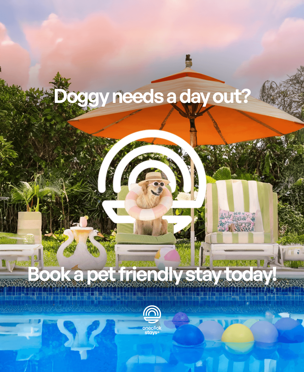
The brand was built around the feeling of a beach sunset, a moment that signals arrival, relaxation, and fun. This idea informed the logo form, colour palette, and imagery style, creating a brand rooted in emotion rather than transaction.
Visual Language In Practice
The visual language balances system and storytelling.
Illustrations add warmth and approachability, while real life imagery grounds the brand in authentic hospitality experiences. Together, they allow OCS to communicate clearly across both corporate and consumer audiences.

Social And Marketing Rollout
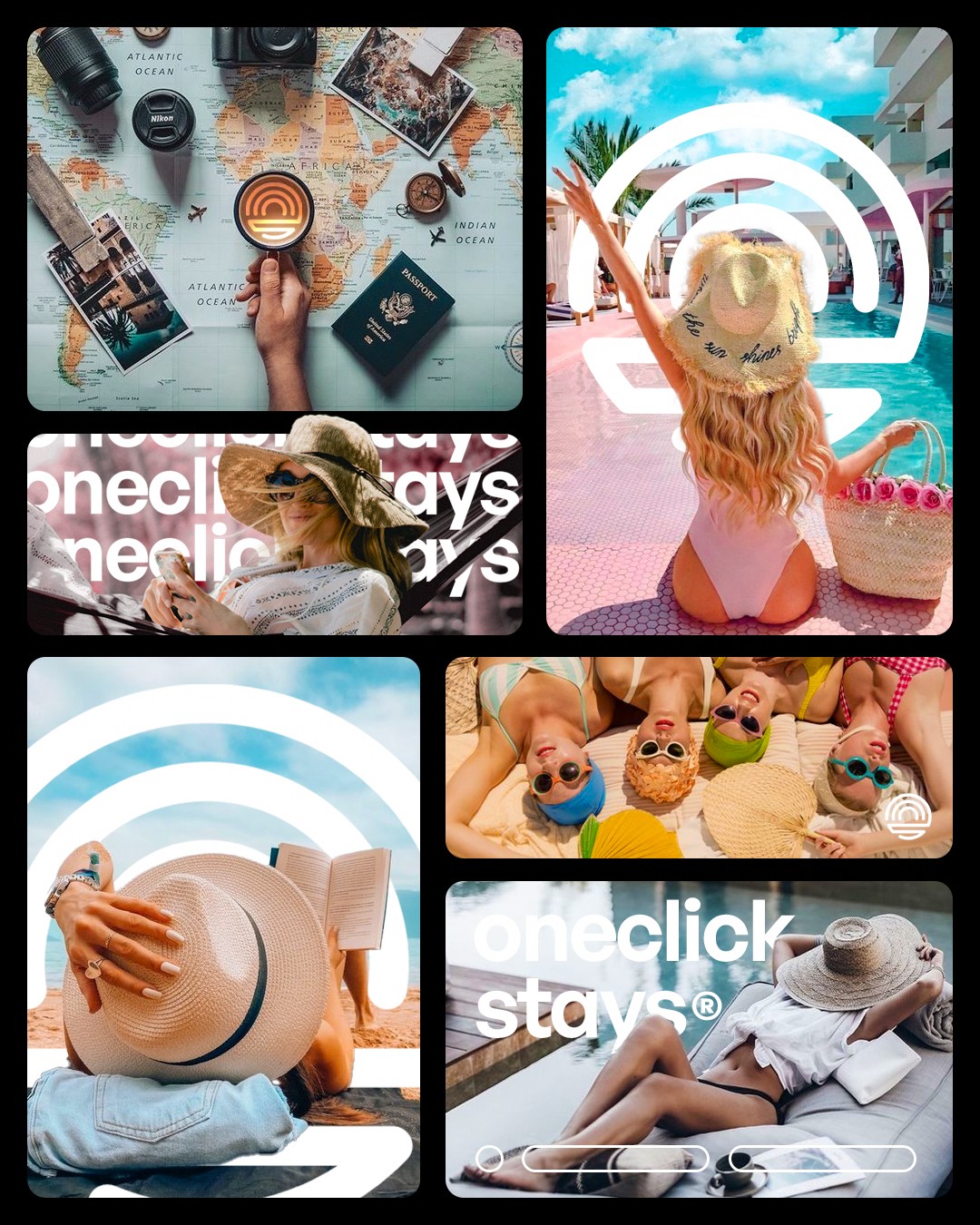
The rebrand was rolled out across social and marketing touchpoints with a focus on consistency and speed.
Instead of designing one off posts, the system enabled repeatable templates that maintain strong visual recall while allowing flexibility in content.
What this enabled:
🔁 Repeatable, scalable templates
👀 Strong brand recall on social
⚡ Faster content creation for teams


The rebrand repositioned OCS from a functional booking platform into a lifestyle led travel brand with a clear point of difference. By leaning into colour, motion, and emotion, the identity increased memorability, improved social engagement, and better aligned the platform with its beach party focused audience.
This project reinforced that in crowded digital marketplaces, brand personality is a competitive advantage. Travel products benefit from emotional storytelling, not neutrality, and a strong visual system can shift perception without changing the core product.

