BRANDING
DESIGN SYSTEM
WEB DEVELOPMENT
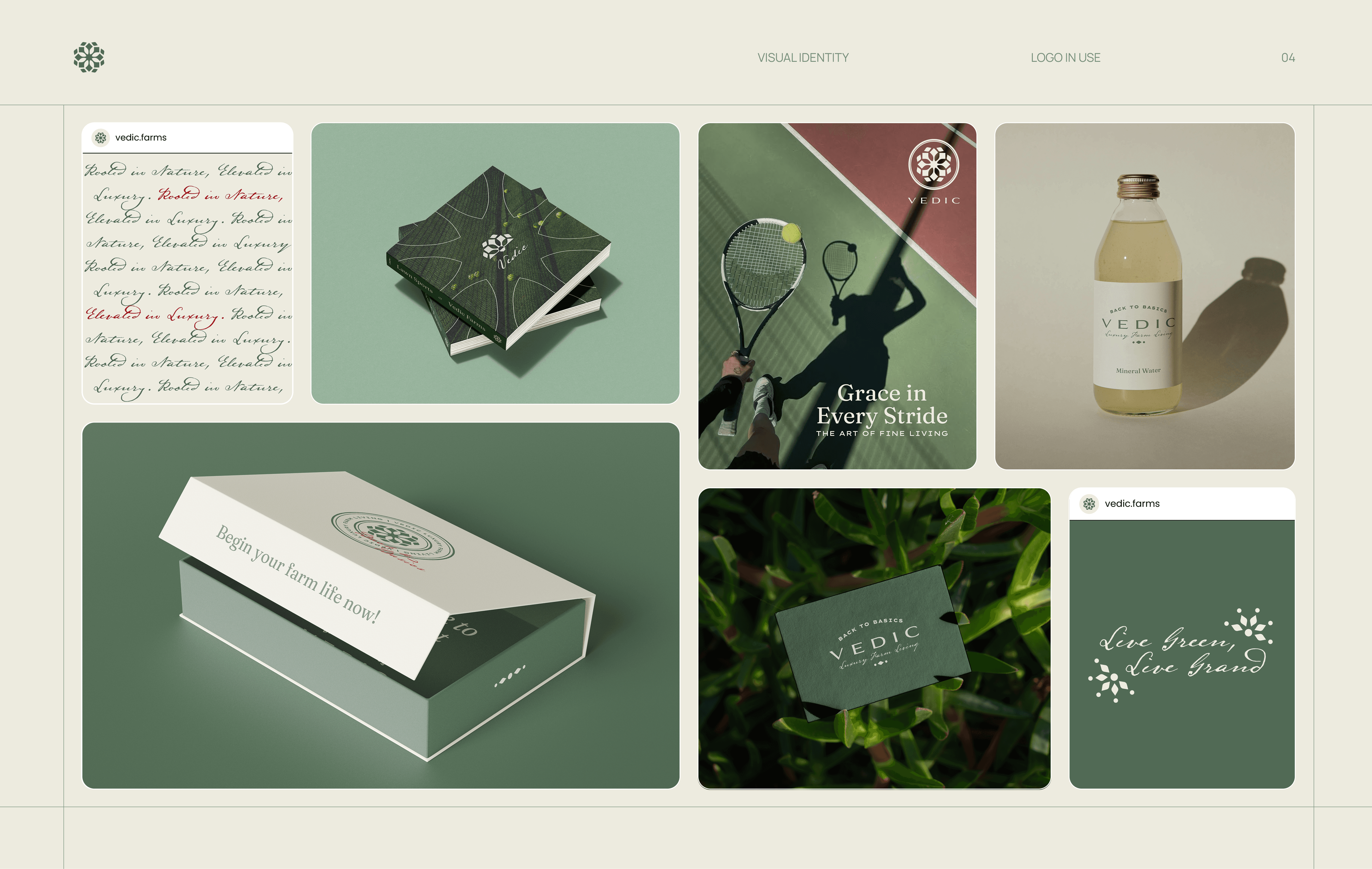
MARKETING COLLATERALS

Vedic Farms is a luxury farm living project by a leading Hyderabad based real estate developer. Scope included brand identity redesign and website direction. I led the rebranding, visual system, and brand expression across touchpoints. Year 2024. Industry: luxury real estate.
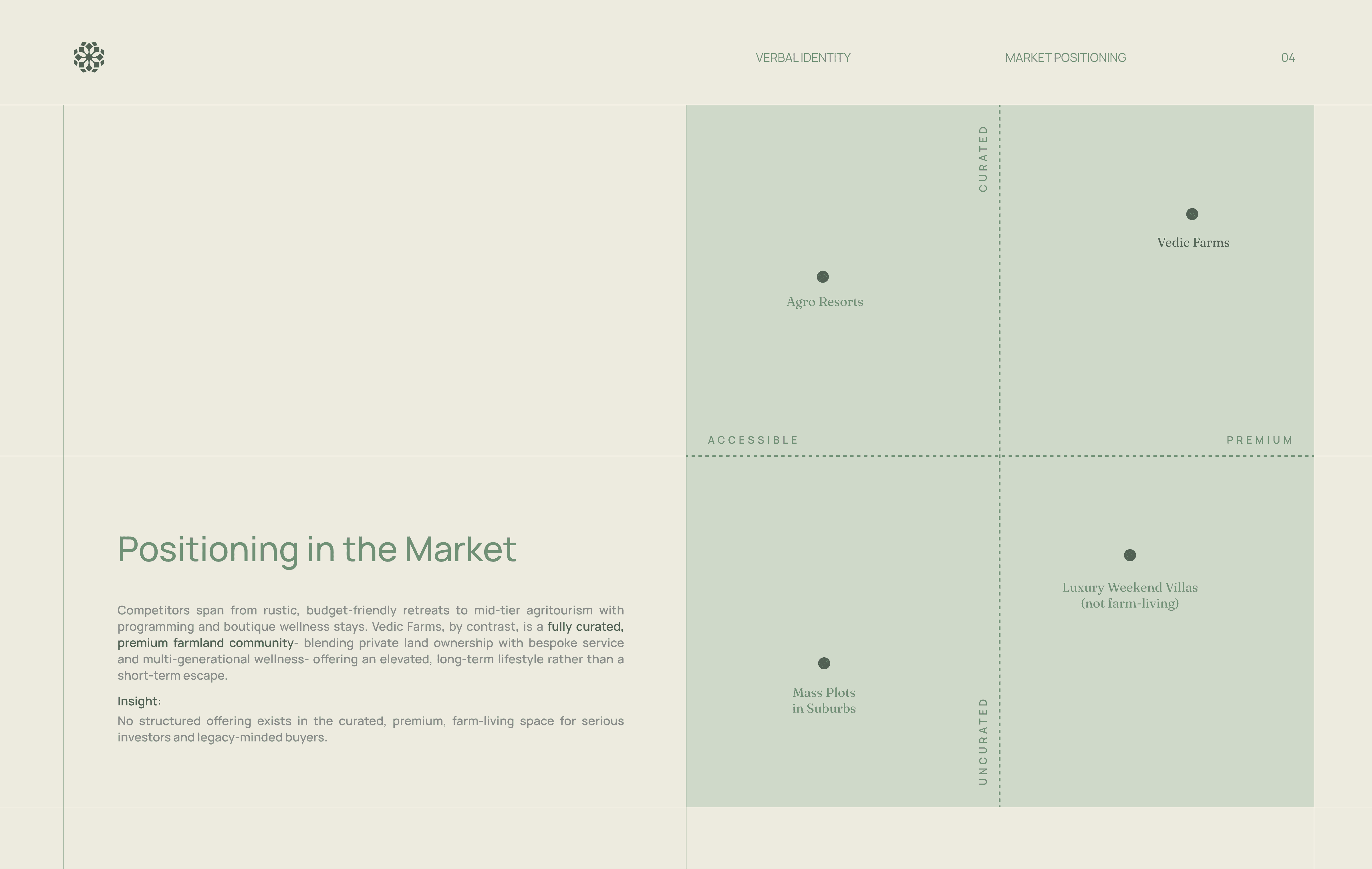
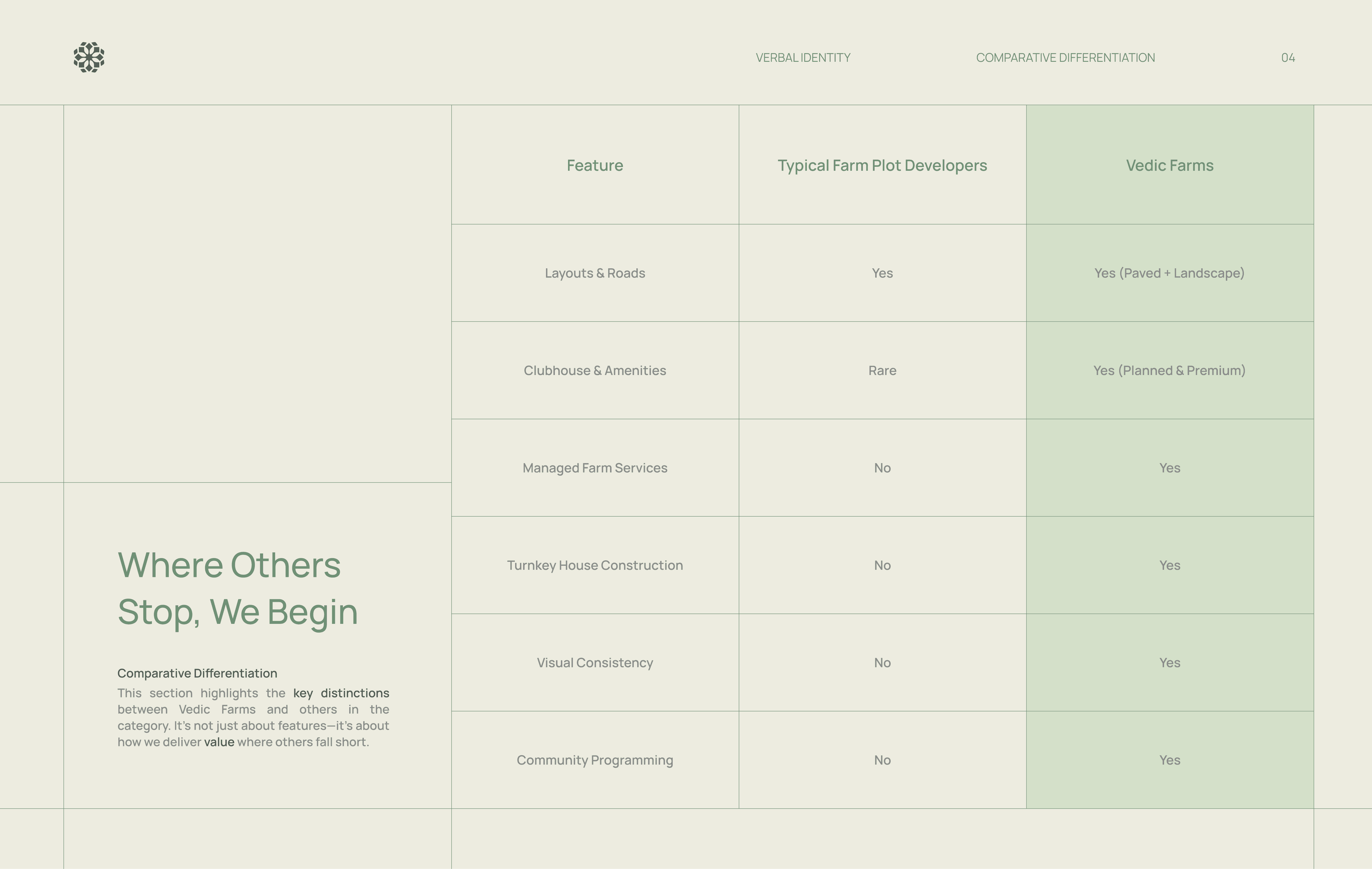
Vedic Farms introduced farmhouses as a primary residential product, targeting high net worth buyers seeking privacy, land ownership, and long term lifestyle value. The brand sits between luxury real estate and nature driven living in an emerging, undefined market.
The project established Vedic Farms as a credible and aspirational category leader in luxury farm living. It demonstrated how strategic restraint and system led branding can elevate perception, build trust, and support long term scalability when introducing new ways of living.
The goal was to create a distinctive luxury identity that felt rooted and timeless, elevate farmland into a desirable lifestyle choice, and establish a scalable brand system that could extend across digital, spatial, and marketing applications with consistency.
Brand Strategy Insight
The brand needed to feel like land first luxury rather than real estate marketing. The guiding idea was to design a system that felt calm, permanent, and restrained, allowing the value of land, architecture, and lifestyle to lead instead of overt sales driven visuals.
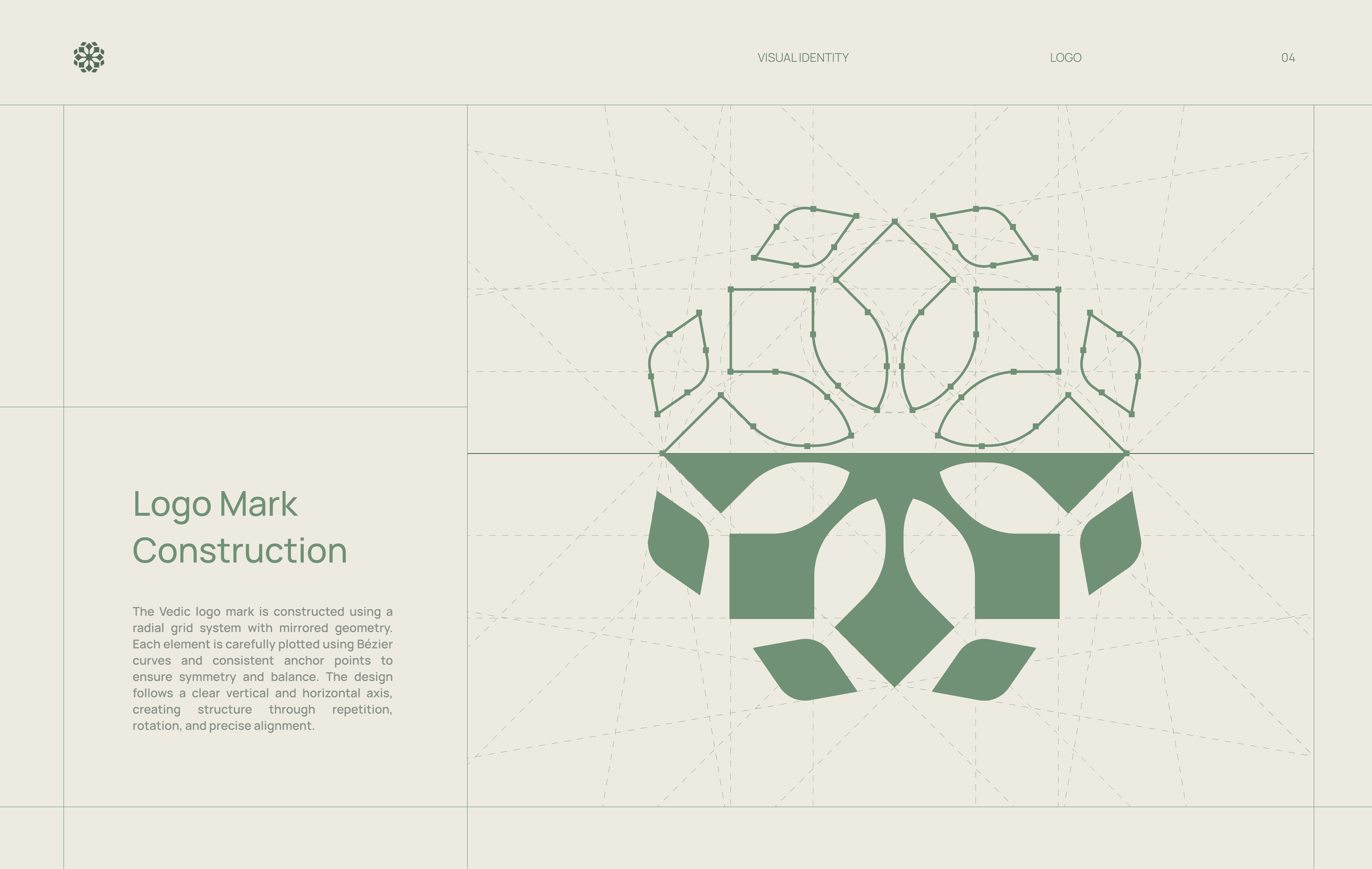
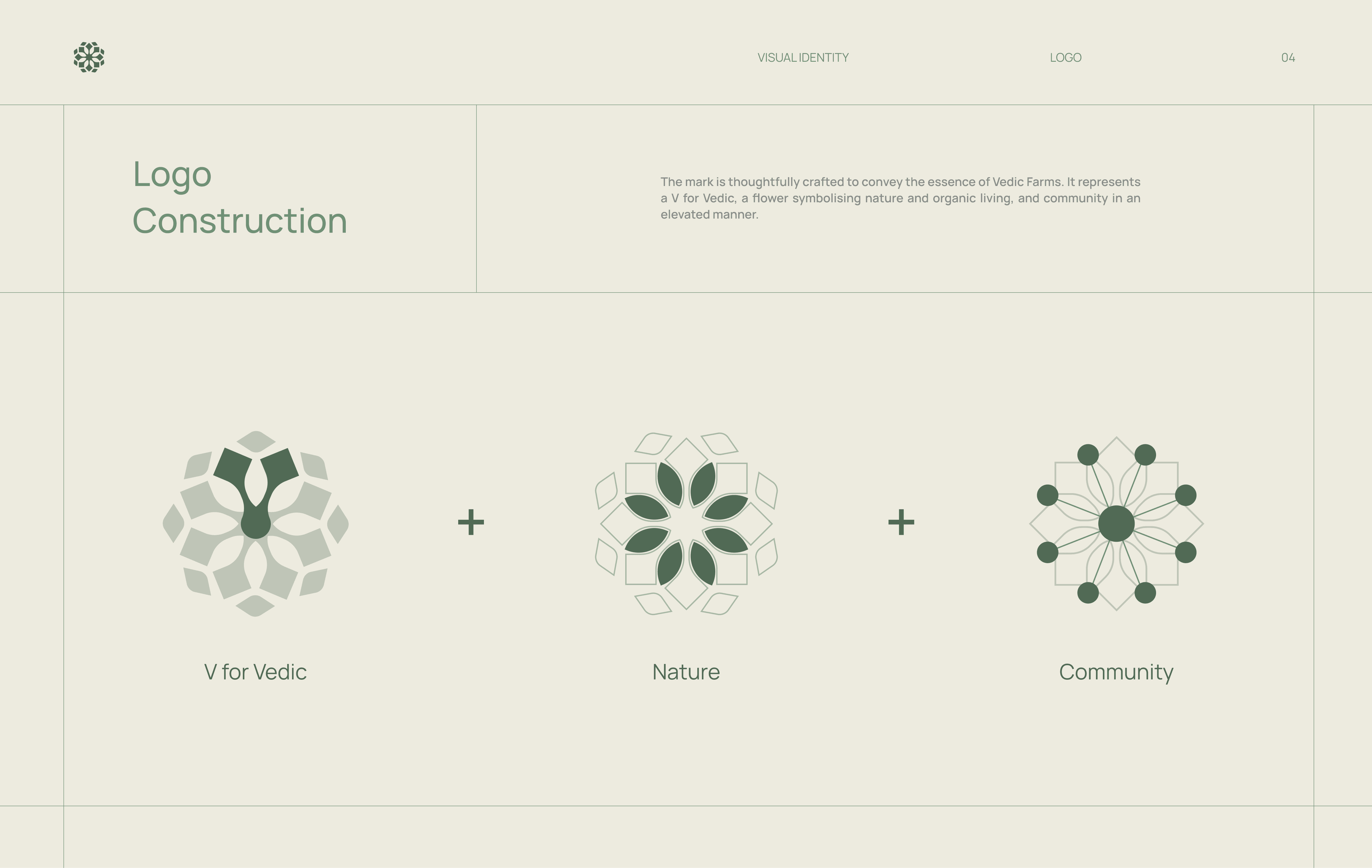
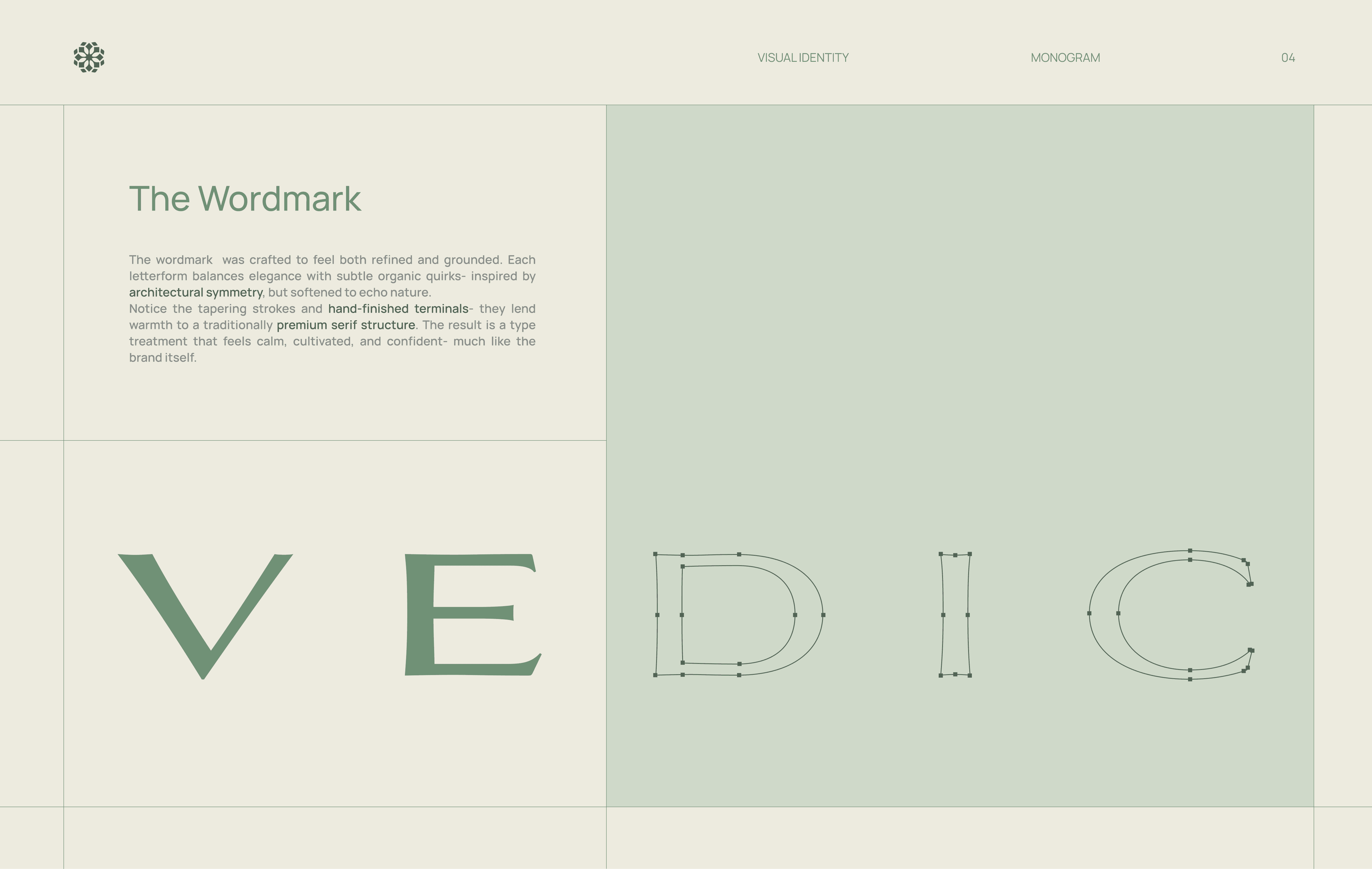
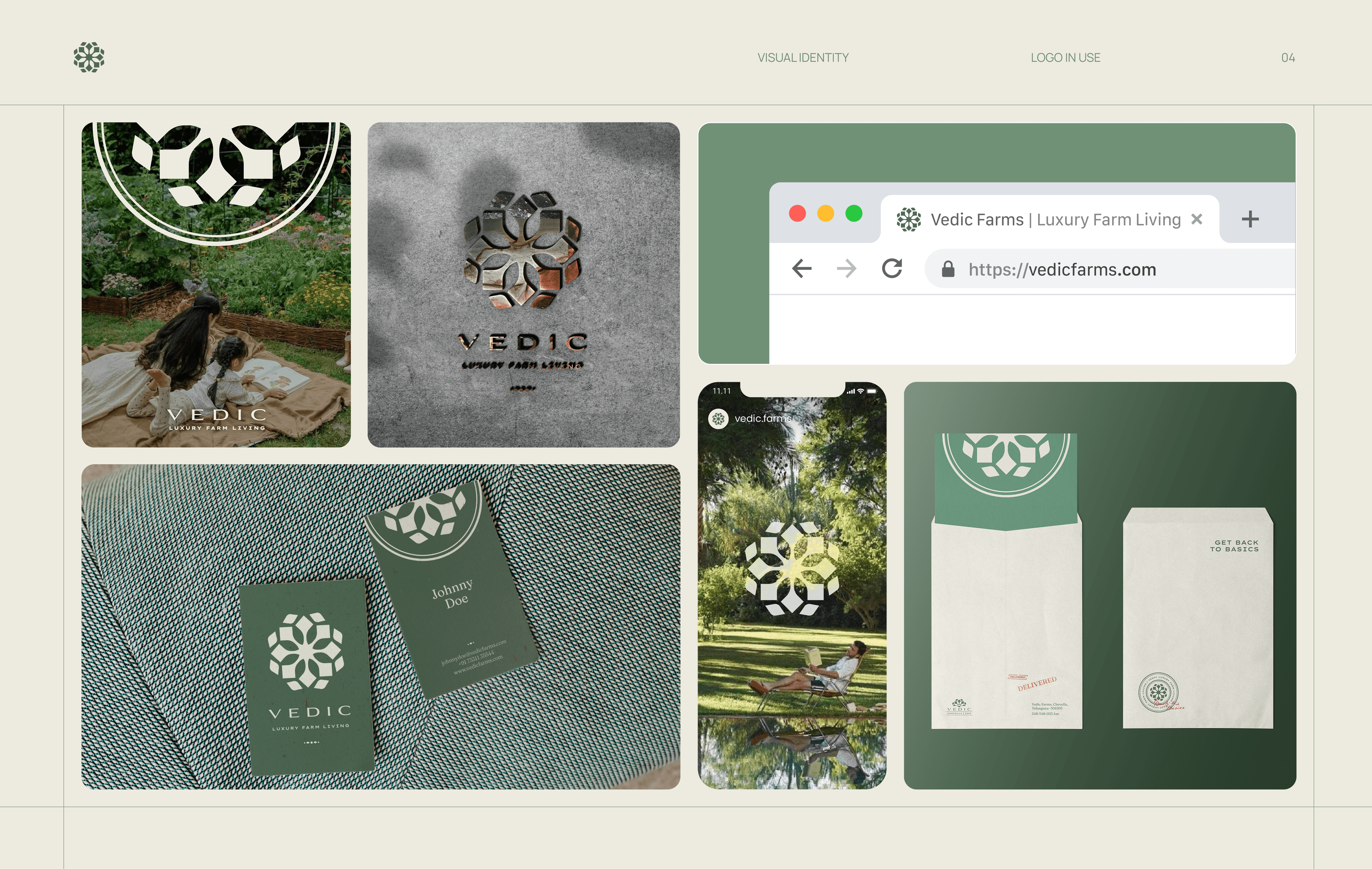
Logo Formation
The logo was designed as a structured wordmark that balances heritage and modernity. Its proportions convey permanence and trust, while restrained detailing avoids decorative clichés, allowing the brand to sit confidently in the ultra premium real estate space.
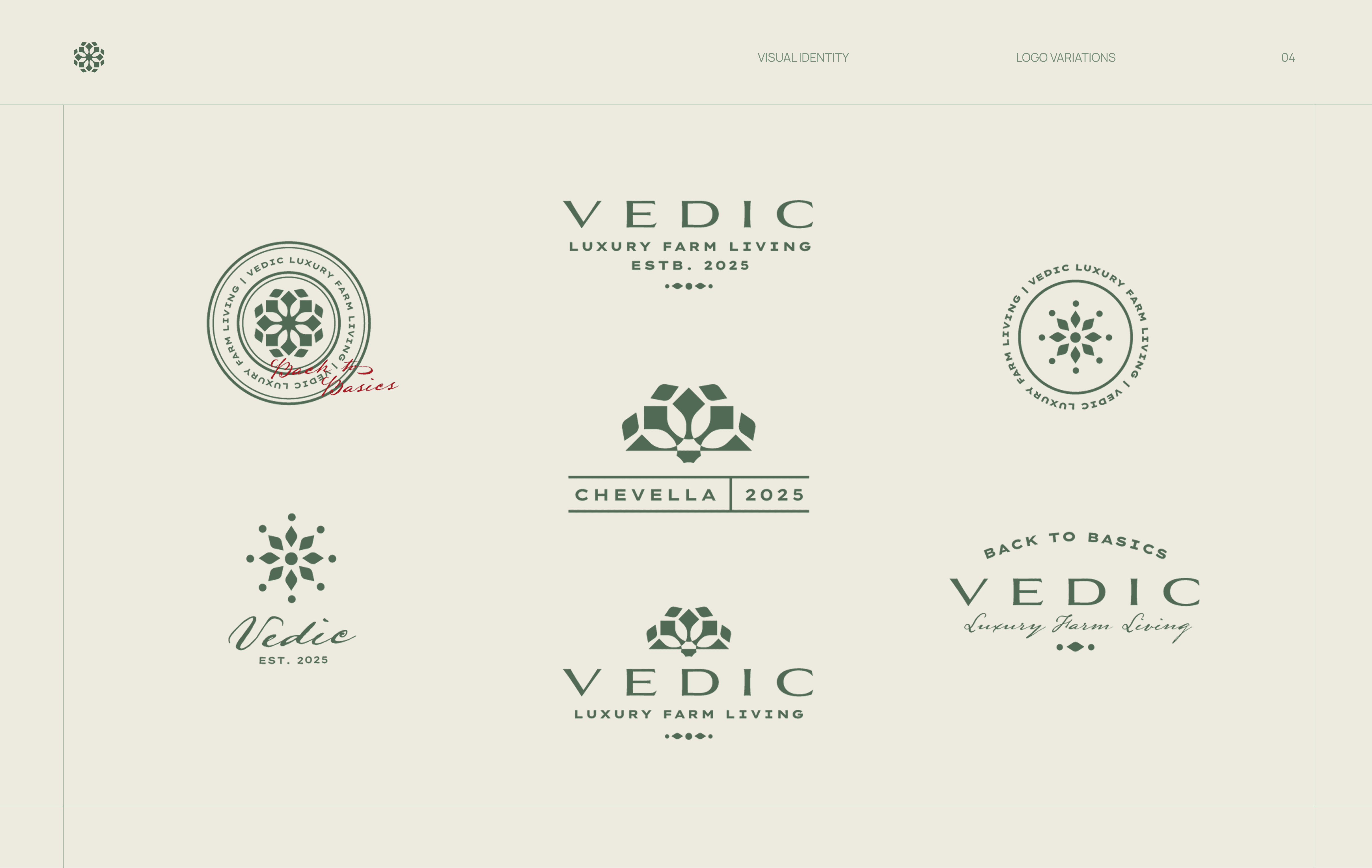
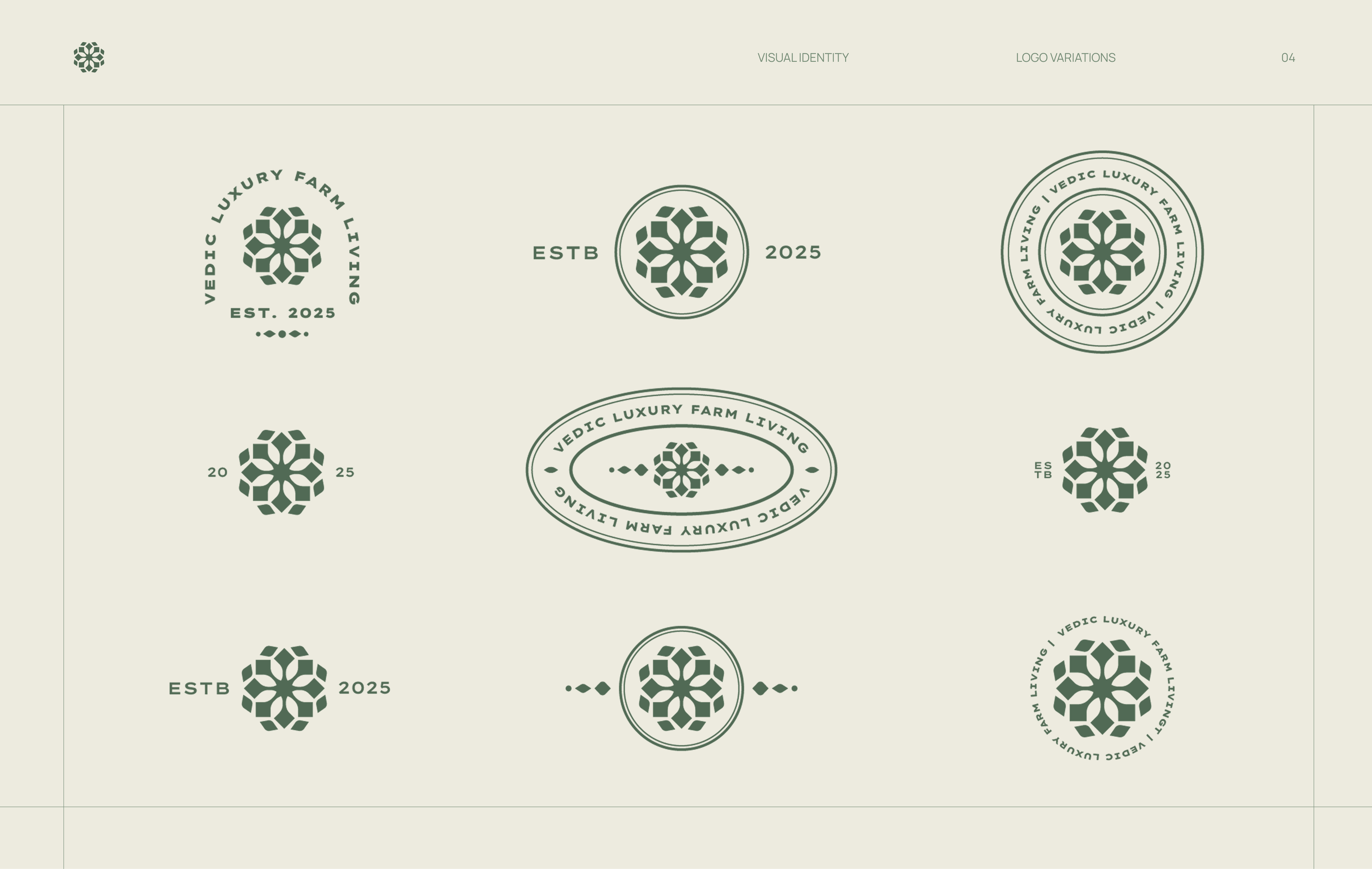
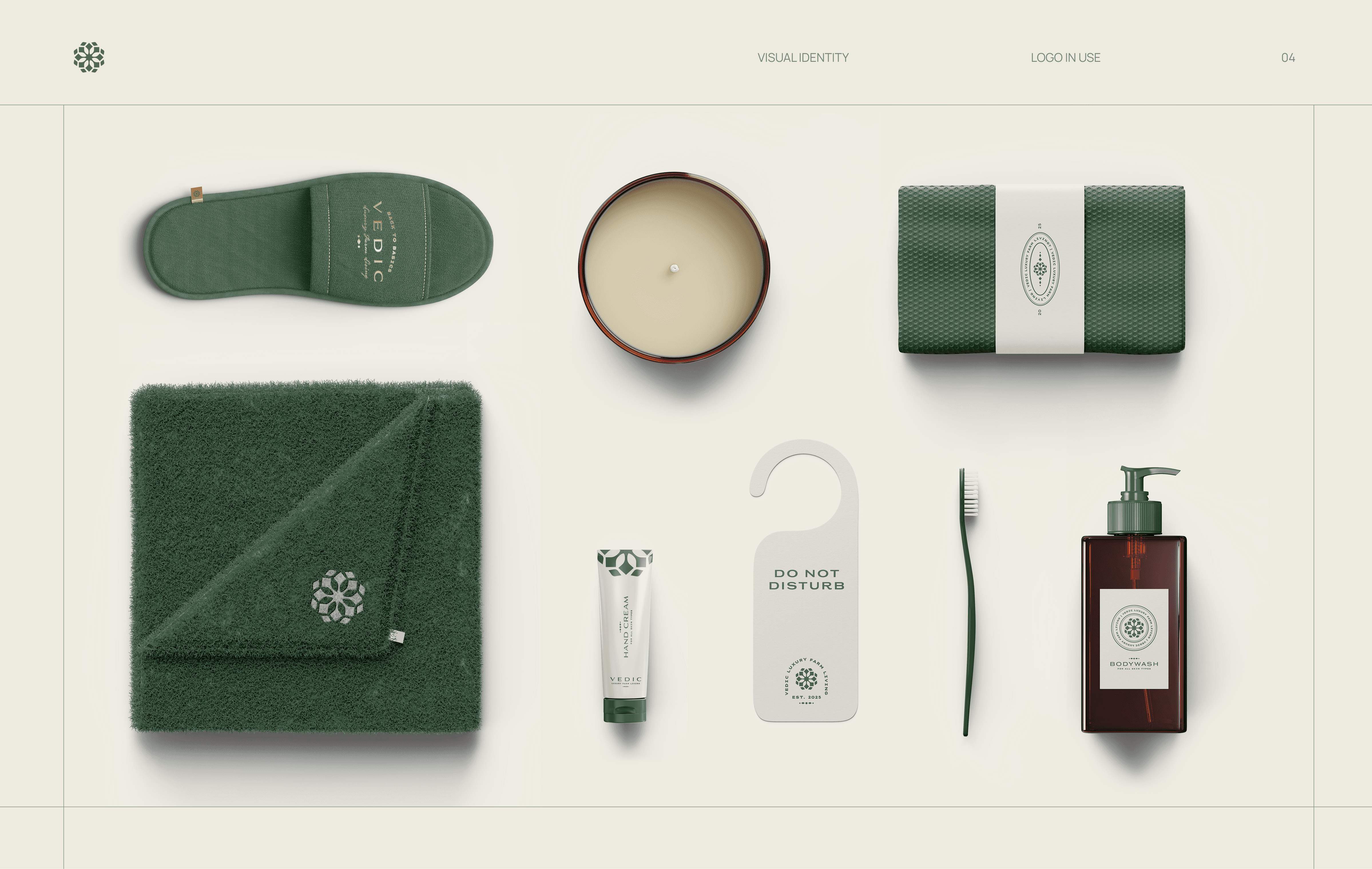
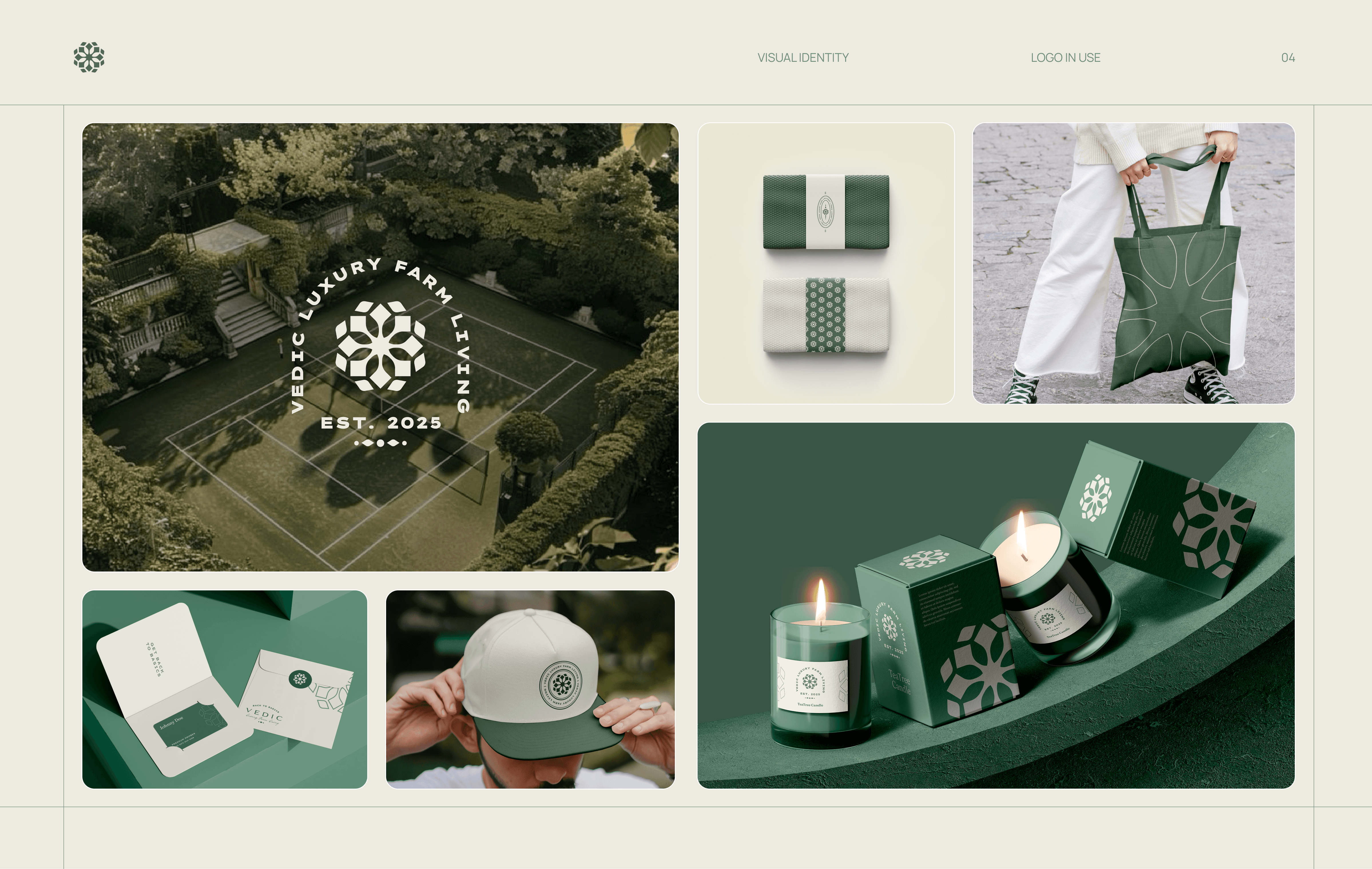
Alternate Brand Marks
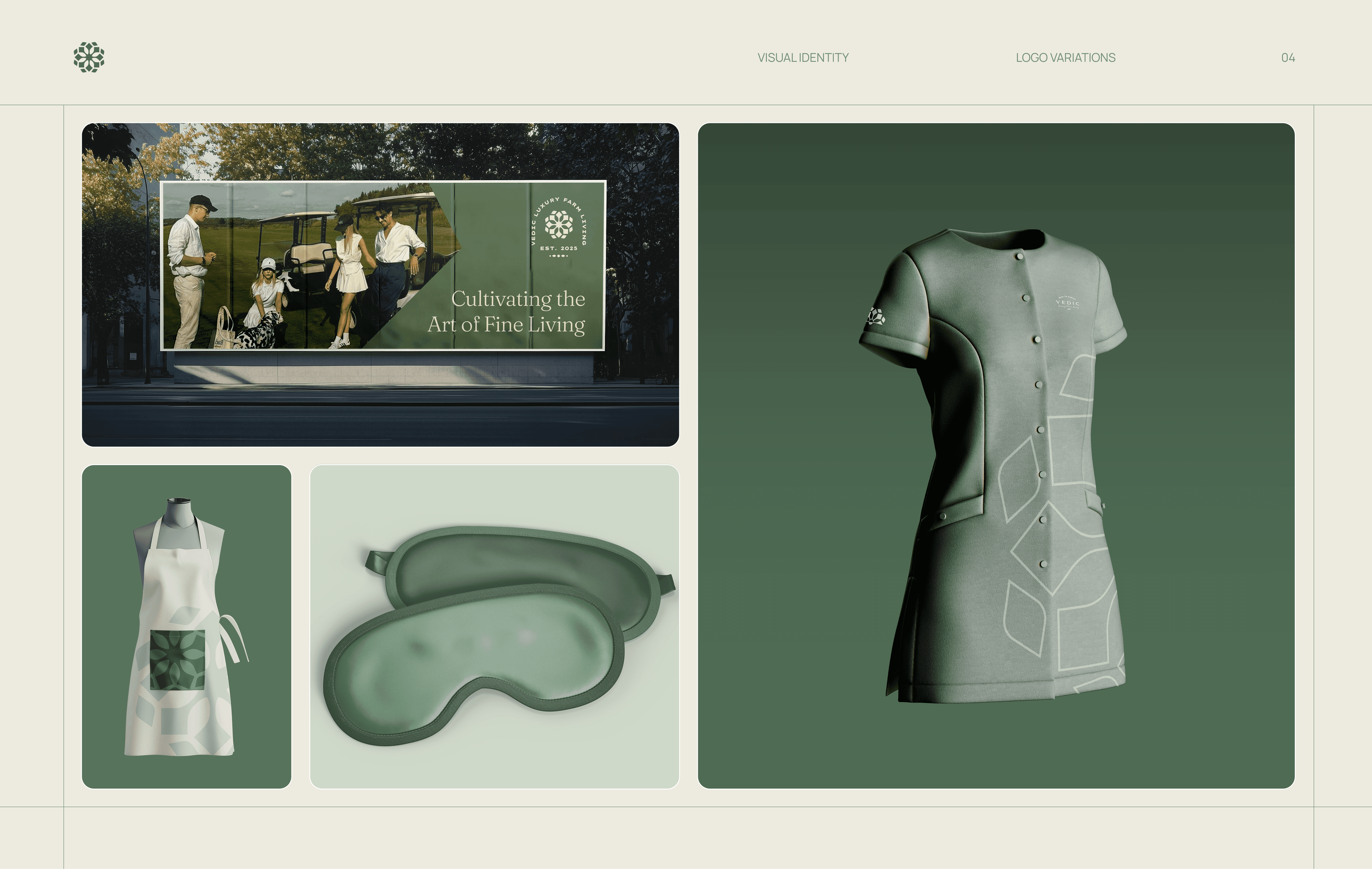
A set of alternate brand marks was developed to support different contexts and scales. Compact and simplified versions allow subtle branding across digital icons and physical touchpoints, while maintaining consistent proportions and recognition across all applications.
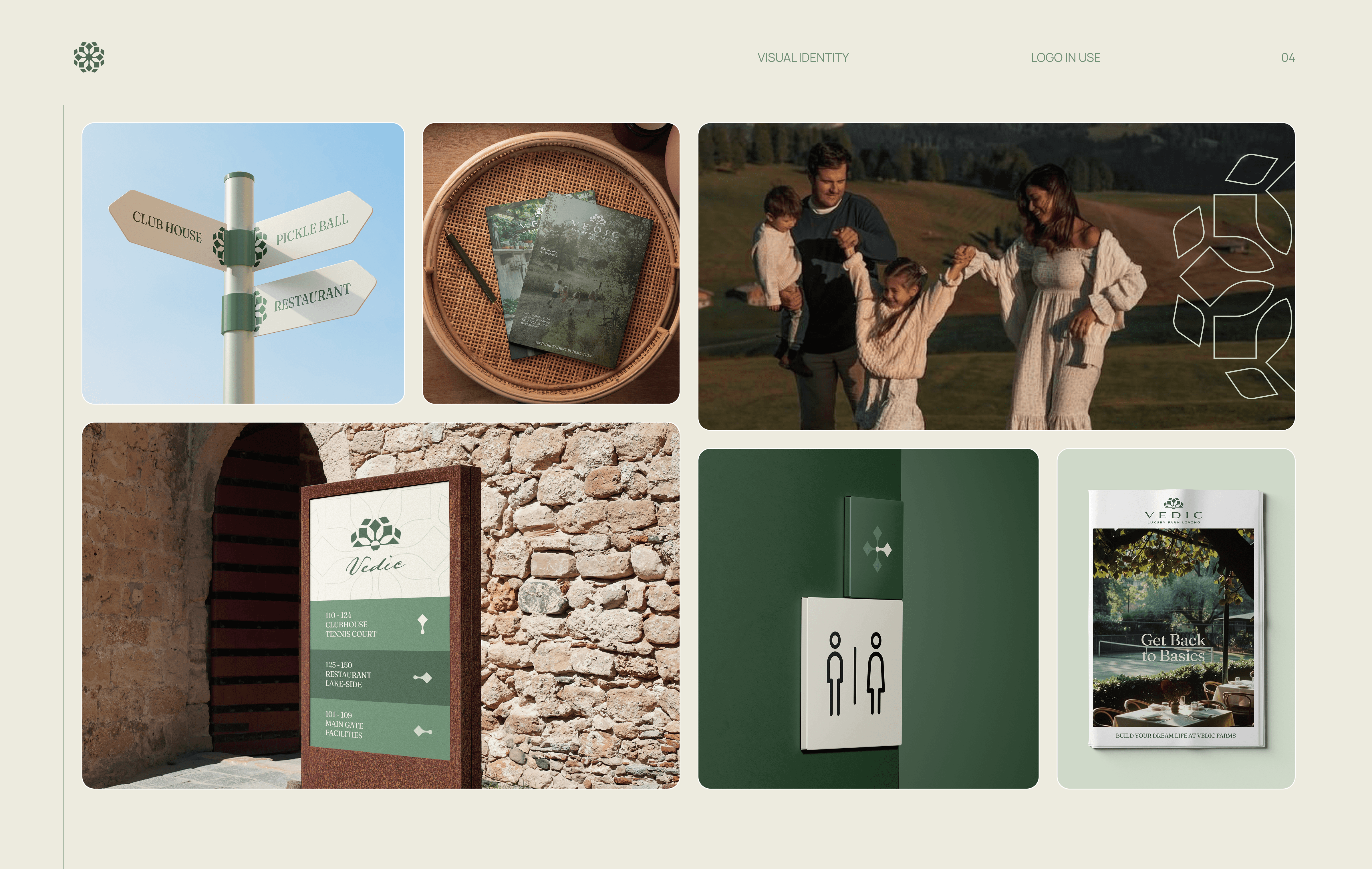
Design System
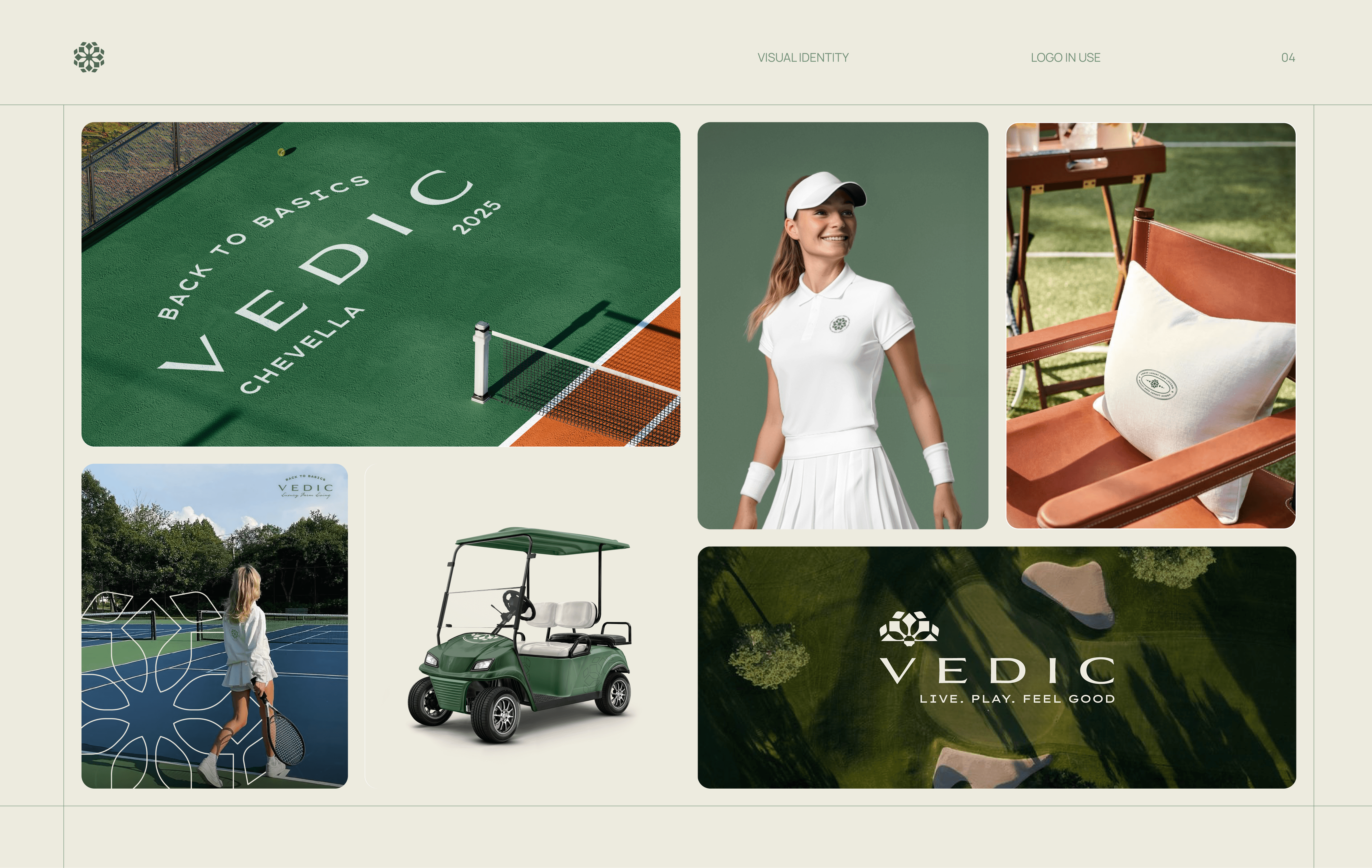
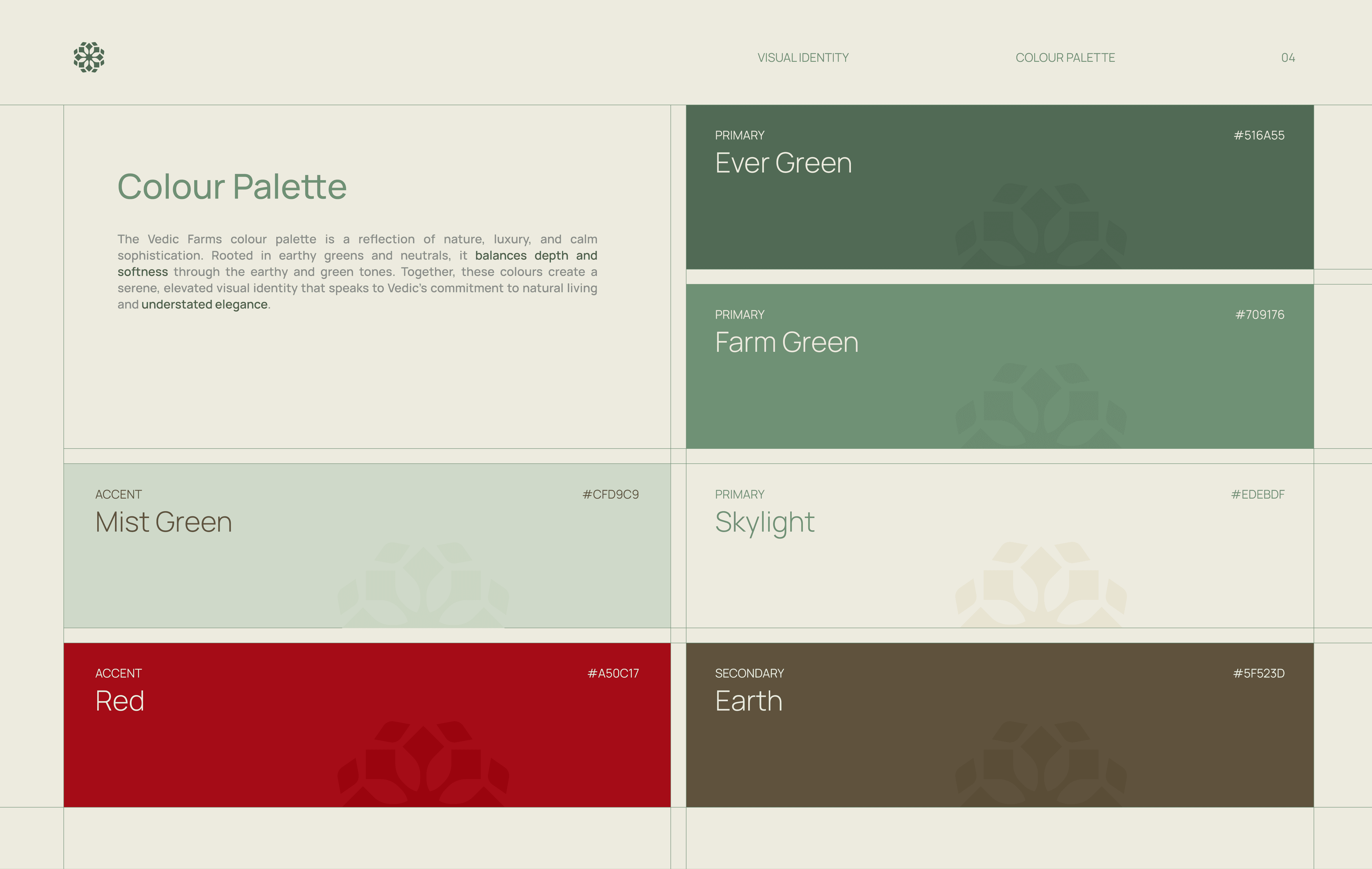
The visual identity system was designed to stay quiet and consistent across scales. A neutral colour palette, editorial typography, and modular grids create clarity and hierarchy, ensuring the brand remains timeless while giving space for land, architecture, and lifestyle imagery to dominate.
Modular grid system with fixed margins and spacing rules for print and digital consistency
Neutral colour palette with defined primary, secondary, and accent roles
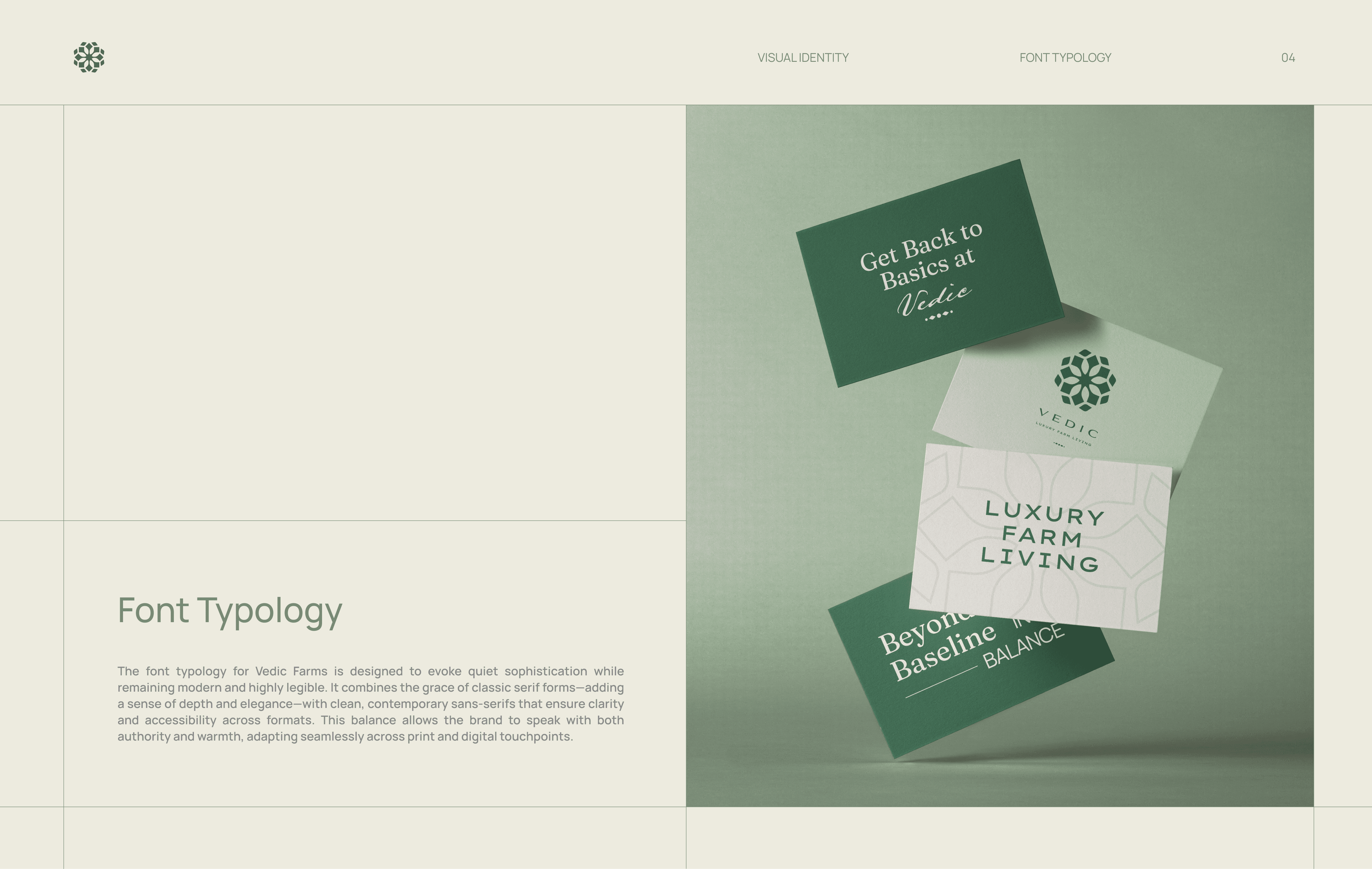
Editorial type pairing with a clear hierarchy for long form and marketing use
Defined type scales, line heights, and paragraph spacing for readability
System designed to scale across brand, digital, and on ground applications
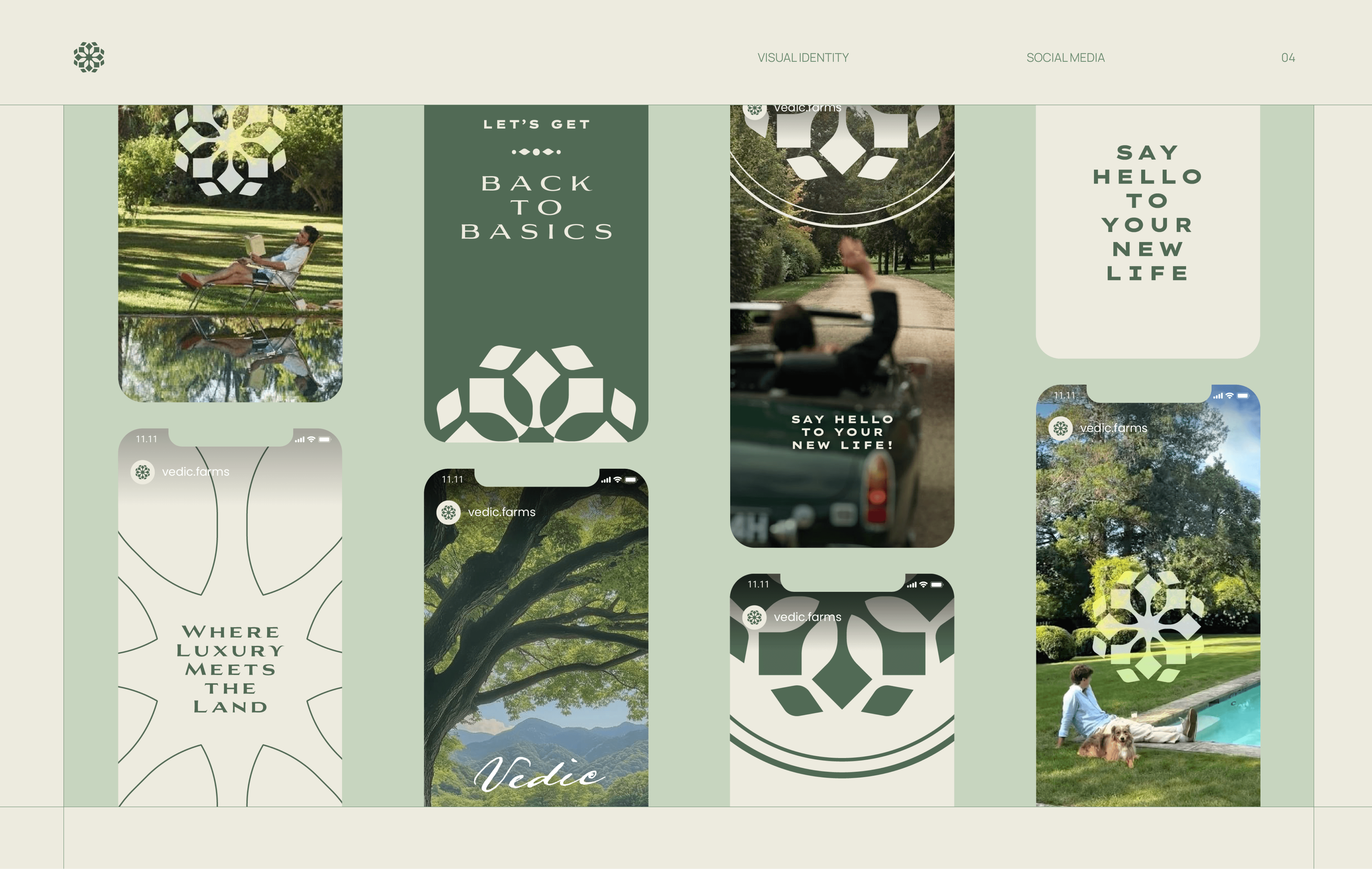
Digital Brand Presence
The website extends the brand into a narrative led digital experience built around aspiration and trust. A restrained interface, clear hierarchy, and immersive visuals shift the focus from selling property to communicating land, lifestyle, and long term value.
This project highlighted how strong branding can legitimise an emerging real estate category. Strategic restraint, clarity of positioning, and system thinking proved critical in aligning perception with value when introducing new ways of living.

